Monday, March 30, 2009

Braniff Terminal - Dallas Love Field

Remember when flying was fun? Not just the thrill of boarding an aircraft and flying to a destination, but the arrival at an airport and checking in for the flight. Today airports are impersonal and sterile places where architects and interior designers have become lazy relying on large vaulted ceilings and plenty of light to create an ambience, which they themselves cannot. We try and spend as little time as possible at these so called marvels, because the interiors are anything but inspiring.

Curbside and airside after we have passed through security we are faced with bland concourses and departure lounges that seem more like a suburban shopping mall or prison waiting room. Since the advent of jet travel, few airlines have taken the bold step, of creating spaces that were different both architecturally (TWA Terminal JFK) and interior design wise (Braniff- Love Field Dallas).

Braniff opened their terminal of the future at Dallas Love Field in 1968, designed by Jack Corgan and decorated by Herman Miller with Ray and Charles Eames designs. This was the start of the space age, with metal disc minis from Paris and ‘2001- A Space Oyssey’ waiting to hit the big screen. The airline had started their “The End of the Plain Plane” campaign earlier which saw a complete makeover of everything to do with Braniff, from Pucci uniforms, aircraft, ticket counters and everything the public would see. This was a corporate makeover with a “BANG”, which the travelling public couldn’t help but notice, and I am sure influenced one as to which airline you would buy a ticket for.

On arrival and checking in for you flight, you had a sense of what you were going to expect from Braniff. Even though the check in area might not have been as light filled as some modern day equivalents, here was a space that one noticed, from the use of natural wood, to the ceiling with Braniff advertising suspended from reflective discs, to the continuous Braniff logo behind the counters.
Another area used large spheres of light clustered together to give a very space age feel, that drew your eye up to the ceiling.
Lighting treatments were a big factor of the terminal design. Instead of relying on natural light (which isn’t a bad thing) designers used different effects that would enhance the other materials used in the space. Note the silhouettes of the planes behind the check-in counters. In a modern airport do we see any reference to what the purpose the building holds? Not one picture or image of a plane or a picture of an exotic location, only banal advertising for mobile phones or credit cards dominate public spaces.

Once airside and into the departure lounge we could be forgiven for thinking that we were in a hip nightclub or a pop art gallery.

Bright colours, stripes and corporate logos adorned the walls, and bought us quickly into the space age.

This time airside at some of the gates the passenger was met with a soaring ceiling, with hanging pop art that again drew our eyes above our heads. Screens around clustered seating gave us privacy, which was not necessarily a good thing, however after waiting in today’s excuses of departure lounges and the seething mass of tired humanity that inhabits them, I think the screens are a good idea.

Even the baggage carousels were not immune, and gleamed with stainless steel and op art imagery

Now that flying has become so much of a necessity for some and not the special occasion it used to be, can't the airlines and architects make the experience a little more pleasurable? Give us something to look at while standing in line to check in or going through security. Make us think about our surroundings like Braniff did. While not to everyone’s taste it did give us something to talk about.


Friday, March 27, 2009

Schiaparelli at Home - Shocking Elegance

Elsa Schiaparelli, the reigning empress of Paris fashion between the two world wars, and I say empress because she ruled autocratically dictating her style onto her clients without so much as an apology. Her style was distinct and constantly changing whereas her chief rival Chanel’s was evolving and turning into something comfortable and almost bourgeoisie.

Schiaparelli loved to shock and she was shocking, which translated into all she did, she invented shocking pink, named her premier perfume ‘Shocking” and her auto-biography was called ‘Shocking Life’.

Schiaparelli’s life at home in her favourite house, a mansion on the Rue Berri in Paris, reflected a fertile imagination that was not afraid to try different things, for the pure enjoyment that they would bring. Stuff was everywhere, tables scattered with various objects ranging from the sublime to the ridiculous. A lamp with as its base a sculpture of a young woman, gilt goblets, and what looks to be a gold or silver slingshot. A bizarre object of a sphere on a stand with holes through it and spikes on top almost looks like some obscure instrument of torture.


In the entrance hall stood two mammoth carved wood statues representing Mr. and Mrs. Satan standing guard screening whoever dared to cross the threshold.

She enjoyed her Paris mansion dressing accordingly at home so that she was almost a part of the tableau she was presenting in each room.


The only way one could tell her bathroom was actually a bathroom was by the bath. The rest of the room gave the impression of an overly crowded sitting room with stuff everywhere. A writing desk in one corner, a sofa in the centre, you could almost entertain guests in this room and I am sure the thought had crossed her mind.


The garden on the other hand was deceptively simple, laid out traditionally and yet here it was that she did some of her most lavish entertaining, holding soirées that would rival Poiret’s of a quarter of a century before.

She had other homes around the world, London, New York and Tunisia and I will explore these at a later date.

Tom Adams for Agatha Christie - Illustrated Death

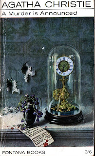
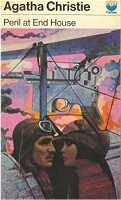
One of my all time favourite series of book cover art are the paintings that Tom Adams created for the Fontana paperback versions of Agatha Christie novels from the early 60’s to the beginning of the 80’s. From this association he has become one of the most famous cover artists of our time, with his illustrations I am sure contributing to the sale of the books.

Whereas any artist would have depicted scenes of the obvious when illustrating a crime novel Tom Adams departed from the norm and would tease the public with seemingly obscure references to the novel contained within the cover. A vase of dead violets in ‘A Murder is Announced’, oversized insects that tricked the eye such as the bee on the cover of ‘Death in the Clouds’, lovers, a gun and bi-plane in ‘Peril at End House’.


Occasionally the blood would be spilled and we would see a partial reference to the crime committed or a body. On the other hand he was quite free in the inclusion of animals that had met with unfortunate fates. A weasel impaled on a paper knife in ‘Cards on the Table’ an owl that meets the same fate in ‘Endless Night’ a decaying fish on the cover of ‘Towards Zero’. Very rarely was violence depicted, only the aftermath. In one of the most thought provoking covers we see the white dove of justice picking out the eyes of a black crow for ‘Ordeal by Innocence’.


If Mrs. Christie’s use of nursery rhyme titles was not sinister enough for the titles of some of her novels, coupled with the corresponding Adam’s illustration they could be downright disturbing. ‘A Pocket full of Rye’ with the decaying bird super imposed on a background depicting the song, ‘Hickory Dickory Dock’ using the same treatment, however this time with a hypodermic syringe and scattered gemstones, and then one of the most unsettling; a golliwog hanging from a blood stained stake with a rather disquieting looking lizard in the background for ‘Ten Little Niggers’.


Numerous times we would see the weapon used or the means of how a murder was committed. Who now can drink champagne from a champagne glass such as the one depicted on the cover of ‘Sparkling Cyanide’ without some form of second thought?

The covers are a rich visual reference that have not been equaled or surpassed by any other artist or stylist who has been given the task. The paintings are highly detailed vignettes of the story, painted with sensitivity to the written word. Occasionally he blunders on the details but these blunders do not detract from the story within.

They say ‘never judge a book by the cover’ well, in this case do! You won’t be disappointed. Even if you dont read the books, the covers will definitely provoke some kind of thought.

S.S. France - Luxury With an Edge

I came across a series of photographs on the Time Life image bank taken on the board the new French Line’s superliner, France of 1962 by Stan Wayman. Here is a set of images with seemingly real passengers enjoying the liner’s stunning public rooms. Usually one sees pictures of these spaces empty or with a few posed models artfully arranged, so it was rather good to see these rooms photographed with their real purpose in mind, filled with people enjoying life.

The France of 1962 was the French Line’s post war answer to the legendary Normandie of the 1930’s, Here again the French created a tour de force in maritime and interior design showcasing the best that France had to offer. Although smaller than the Normandie, the France was no less an equal.

Interior designers used the latest techniques and materials to create interiors that shone by the day and shimmered by night. Anodised aluminium stood in perfect harmony with tapestries and paintings that heralded a new era in shipboard design, creating interiors that were bold and yet comforting to the ship’s passengers crossing the Atlantic.

Joie de vie reigned supreme on all levels. Women dressed for dinner in their best and were gallantly escorted down the grand staircase by their elegantly dinner suited companions into the 1st Class Salle à Manger Chambord. The walls shimmered in gold anodized aluminium while the cobalt blue ceiling twinkled with lights imitating the night sky. Chairs were strangely angular, in red, orange and cream. Around all four walls of the room Jean Mandaroux's continuous mural, painted on 17 lacquered aluminum sheets, was entitled "Les plaisirs de la vie": The Pleasures of Life.


Another prime focal point of the 1st class passenger’s public rooms was the opulent smoking room, the Salon Riviera aft over looking the stern. Modern art mingled with traditional in a room that rose through two decks and was equally inviting by night and day.


The 1st class main lounge Salon Fontainebleau seemed softer in colourings and treatments than other public rooms however maintained an edge with stunning abstract tapestries along several walls imitating stained glass in rich colours edged with black.

The First Class cabins also showcased design and art, especially in the Apartements de Grande Luxe of which there were two.

This isn’t to say that Tourist Class passengers suffered by travelling in ‘reduced circumstances’. Again interior designers pulled out all stops in the decoration of these spaces. The tourist class smoking room, Café Rive Gauche, had a hard industrial edge to it with chairs that looked as if they came out of a mecano set. Add people to this and you have a room that breathes life and joie de vie.

The two deck high Tourist Class, Salle à Manger Versailles was an equally impressive space that by no means indicated that one was travelling in tourist. The walls were produced from Polyrey and Formica with a decoupaged gold leaf abstract pattern. Only the forward wall held a mural done in 14 engraved glass panels by Max Ingrand, as well as two tapestries, "Les amoureux du printemps" by Marc Saint-Saëns, and "Paysage provençal" by Auvigné.
I could go on forever extolling the superlatives of this wonderful ship and bore you all to tears. Although she was a product of the same era as P&O’s Canberra and Orient Line’s Oriana, she had an entirely different approach to her interiors. Whereas the British Ships had a stark almost clinical feel, the France was luxury at it’s most refined.

Blog Widget by LinkWithin