Saturday, May 14, 2011

The Colour of White


“My life and fortunes are a monstrosity,”
“Partly because of Hera, partly because of my beauty.
If only I could shed my beauty and assume an uglier aspect
The way you would wipe color off a statue.”
moans Helen of Troy in a play by Euripides.

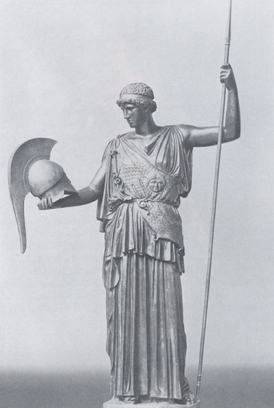
It seems that Helen has had her wish fulfilled, as when we think of classical Greek or Roman sculpture and architecture, we tend to imagine white marble. It is upon this assumption that we base our whole conception of classical sculpture and architecture on.

Take for example, that Caligula's handsome, marble face has stared out at a fascinated world for almost 2000 years. Now situated at the Ny Carlsberg Glyptotek museum in Copenhagen, the celebrated first-century bust of this cruel young Roman emperor is made repellent, yet intriguing, not so much by his petulantly downturned mouth as by the blank, staring eyes chiselled from marble by an unknown sculptor.

So, no doubt we are a bit surprised when confronted with an exact replica, with somewhat unthreatening hazel eyes garish pink skin and glossy brown hair. The bust now looks like one of those funny old mannequins you used to find in certain stores selling men’s hats or the like.

Scientists have now come to the conclusion that most likely many statues and buildings were actually painted and probably adorned with jewellery. A couple of years ago the Vatican Museum hosted an exhibition called “The Colours of White” of some of the most famous classical statues and antiquities with reproductions painted as close to the originals as they can , made possible because many statues contain trace amounts of pigment from their original coats of paint.

When most of these works were discovered, most of the paint had usually come off leaving us with a distorted view of what art was like in ancient times. Over time the idea of unpainted sculpture began to be propagated by art historians as correct/beautiful/preferred. If this is the actual case I'm sure that ancient Greeks and Romans would think it bizarre that later cultures left their sculptures white and unadorned all in the name of classicism.

Consider if Michelangelo's David had been painted. You can get an idea of what it might have looked like from this sculpture created after Michelangelo's David by a German artist, displayed in Cologne as part of the Museum Ludwig collection.

Art and art history could have been totally different than how they have turned out.

Ever since they became the object of scholarly interest, classical statues have been trapped in an aesthetic cage erected by the German scholar and father of modern archaeology, Johann Joachim

“Colored statues? To us, classical antiquity means white marble. Not so to the Greeks, who thought of their gods in living color and portrayed them that way too. The temples that housed them were in color, also, like mighty stage sets. Time and weather have stripped most of the hues away. And for centuries people who should have known better pretended that color scarcely mattered.”

“White marble has been the norm ever since the Renaissance, when classical antiquities first began to emerge from the earth…..Knowing no better, artists in the 16th century took the bare stone at face value. Michelangelo and others emulated what they believed to be the ancient aesthetic, leaving the stone of most of their statues its natural color. Thus they helped pave the way for neo-Classicism, the lily-white style that to this day remains our paradigm for Greek art.

Art and art history could have been totally different than how they have turned out, unless we take the cue from the artist who created the below statue using the discus thrower as inspiration!


Friday, May 13, 2011

Not Happy

Ok, as you all know Blogger has been down near 24 hours. Now if that was not bad enough we have been informed that all posts since Wednesday May 11th have been deleted! Yes deleted! Just a tad disappointed here, and the below sums it up perfectly.

Wednesday, May 11, 2011

Immigrating With Savoir Faire


As regular Savoir Faires are aware I am an ocean liner buff and posted several times on the interiors of the luxury transatlantic liner the S.S. France. This time it is time for the British to make an entry with the Orient Line's Oriana of 1961.Although both ships were born of the same era and respectively were the flagships of their respective companies, the Oriana were vastly different from the France. The France was primarily constructed for the luxury North Atlantic trade, while the Oriana was built for the immigrant trade down under. With this in mind the interior decoration of the British Liner differed vastly from that of the France. Similarly the France displayed the best the French could offer and was a ship of state, while the Oriana displayed the best of British design in the early sixties. However one would be forgiven for thinking that the Brits had taken a few notes from the Scandinavians when it came to the Oriana's interiors


Few ships managed to so well combine the trend setting and traditional. Oriana was the first British ocean liner with a bulbous bow, the first ocean liner with bow thrusters and a television system. She dispensed entirely with masts and booms for cargo handling in favour of cranes and sideporters. More than 1000 tons of aluminium were used in her superstructure, the weight saving permitting an entire extra deck. Yet she was true to many Orient Line hallmarks: the cowled funnel, the concentration of funnel and bridge structure amidships introduced in Orcades, the galleried after decks and the distinctive corn coloured hull. Her décor was coordinated by the renowned Brian O’Rorke, who had pioneered contemporary interiors in British tropical ocean liners with the Orion in 1935.


The Oriana entered service in 1961 for the Orient line on the down under Australian service. While not as streamlined as her eventual running mate the Canberra she was still an attractive ship. Her interiors were strikingly modern taking on an almost clinical effect with the large use of plastics, Formica, glass and natural woods mixed in for good measure. This must have come as a rude shock to the wealthy Australians returning to the mother country for an extended vacation, who were more used to the chintzy kitsch of other liners doing the same run. If the wealthy passengers were in for a shock then the majority of immigrants travelling in Tourist Class must have had a coronary attack! The interiors were probably unlike anything they had ever seen before.


The interiors were light and breezy full of light and space. Artistic decoration seemed to be added as an afterthought to these spaces as there is very little of it. The designers relied on the form and line of the furniture to create comfortable spaces that would become home for the 6 weeks of the voyage.


Even though stark and incredibly practical the interiors were a tour de force in modern design. Everything was stripped down to its bare minimum as can be seen in the picture of the ship’s Tourist Class Stern Gallery. The room has a soft industrial edge to it which makes a beautiful space that perfectly suits the passenger’s needs.

The designers were not afraid to use colour, and the colours that they used were bold and striking which suited the form of the furniture beautifully.


The ship was primarily an outdoor ship with large lidos and swimming pools to suit the warmer climates which she would be travelling in. Windows could be opened allowing fresh sea breezes in.


I would think that if you were a young child, exposed to the wonderful wooden forms in the children’s play room for 6 weeks, that you would automatically grow up to appreciate form and function.

With the Oriana good design and practicality was not a right, but available to all, whether returning squatter or new immigrant. You too while travelling on assisted passage to a new life in Australia, had some savoir faire.

The Other No. 5!

Did you know that there was another perfume named No 5 apart from the now famous and somewhat cheapened Chanel No 5? There was a common trend for the couturiers of the day to affix a numeral to their perfumes in lieu of an actual name which still continues to this day. Funny thing is both Chanel’s No 5 and Molyneux’s No 5 (or Numero Cinq as it was known as in France) were in eerily similar bottles, so there could be some credence in the story related below.


There are two mutually exclusive stories about Numéro Cinq. Apparently Molyneux had befriended Chanel, and together they hatched the idea of each bringing out a perfume called No 5 the same day in 1921, to see whose perfume would be more popular. The outcome of that contest is no longer in doubt, but this version of the story says that Molyneux’ Cinq was far ahead of Chanel’s for several years. The other (recorded in Nigel Groom’s excellent Perfume Handbook) is that Molyneux brought out several perfumes at once in 1925 named after different addresses of the firm: 3, 14 and Numéro Cinq. Molyneux’s Numero Cinq was also referred to as “Le Parfum Connu” (The Known Perfume) to avoid troubles with Chanel. Either way, fashion designers clearly had more of a sense of humor then than now.


Unfortunately for Le Numero Cinq the perfume languished until the early 70’s until it just faded away. Molyneux had retired so the name was not as well known, unlike Chanel who had regained her market share from the mid 50’s after her comeback. As to what the perfume smelt like I have absolutely no idea, which is a shame.


The Molyneux trademark is owned by French company, Parfums Berdoues, and though the fashion component of the firm remains dormant, the firm still produces scents, such as Captain (1975), Quartz (1978), Le Chic, Vivre, I Love You and Quartz Pure Red (2008).


Monday, May 9, 2011

Age Doesn't Matter at JPG


Long regarded the enfant terrible of pret a porter and haute couture I finally think that Jean Paul Gaultier has finally made it. A beautiful highly refined in line and look was his latest presentation for Fall/Winter 2011. Usually we relied on Gaultier for shock tactics, not knowing what he was going to send down the runway next. Collections usually targeted a fairly niche market with not everybody being able to wear his clothes.

The fall 2011 collection had models donning gray beehives with retro wear inspired by the ’50s and ’60s, seductively walking down the long runway. At the end of the runway, the girls took off layers and threw them to the end of the catwalk–perhaps symbolizing the freedom of fashion or maybe just to have a bit of fun as Gaultier is known for. Either way, the smart suits, puffer jackets and bold patterns seemed to celebrate maturity and sophistication.


Even though many described the collection as granny chic, it was highly wearable and suited women of all ages. A purity of line was highly evident, with silhouettes being highly refined and fabrics luxurious. Trailing minks behind her like she has just killed it and is now bringing it home to her mate, she is bold.


Pussy bow blouses in patterned satin along with sparkly tweed pantsuits were hidden under fur trimmed coats, only to be revealed minutes later as each model took off their stuffy overcoats, scarves, and gloves, to discard them at the end of the runway. The only thing was, I was cringing at the thought of so many beautiful clothes being thrown down on the floor!


The song playing whispered, “toutes les femmes sont exceptionelles,” (all women are exceptional) to underscore that old age doesn’t always have to mean dowdy–it can be sexy, too.


To drive the point home, veteran French actress Valérie Lemercier opened and closed the show, doing an alluring striptease with each step. The Gaultier woman has grown up and lives with abandon. She is at least middle age and displays a sassiness that had the audience swooning.


French women just do not age like American women – it’s in the attitude, not the cellulite.

Summer Holiday


Many thanks all for your guesses! The main man can be a bit impetuous sometimes and as you do know we have really just got back from China, which I am still recovering from! Summer vacation is not until end of June, however it is booked!

We have booked to go on a cruise of the Baltic. Now cruising is not really my thing, however as I try and be frugal, the main man came across a wonderful deal.

This will be my first cruise, and knowing how much I love Ocean Liners I cannot wait.

So we are cruising via Holland America to Copenhagen, Germany, Tallin,St Petersburg, Helsinki and Stockholm, with 3 days in London.

Friday, May 6, 2011

We are Going on a Summer Holiday!

Can you guess where?

Hint, several cities in the Northern Hemisphere!


Blog Widget by LinkWithin