Mary Quant uses a play on her name to create a sensuous and sexy add, by calling her colour “Bloody Mary” This is playful and fun, drawing the viewers attention to the lips and colour by making them the same shade as a bloody mary.
Roger and Gallet has their model applying her lip colour in a gauntlet like gloved hand, as if she were going into battle and the final touch needed was a touch of colour to carry her through.
 Helena Rubinstein ushered in the space age with ad below, with the colours imitating the cool clinical space age look of the late 1960’s. Again as in the Rouge Baiser ads the eyes are covered, so as to draw attention to the lips. Notice how the Rubinstein photographer has used the same lines as one of the Rouge Baiser ads
 Just showing the lips in these ads was a very effective tool in selling the lipstick and emphasised that if you need some sort of macquillage, the lipstick was necessary. In all these ads both photography and the drawn line are equally effective, conveying the message with comparative ease
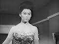
 So ladies, whip out the lippy and put some savoir faire on your lips.
 Helena Rubinstein ushered in the space age with ad below, with the colours imitating the cool clinical space age look of the late 1960’s. Again as in the Rouge Baiser ads the eyes are covered, so as to draw attention to the lips. Notice how the Rubinstein photographer has used the same lines as one of the Rouge Baiser ads
 Just showing the lips in these ads was a very effective tool in selling the lipstick and emphasised that if you need some sort of macquillage, the lipstick was necessary. In all these ads both photography and the drawn line are equally effective, conveying the message with comparative ease
 So ladies, whip out the lippy and put some savoir faire on your lips.