Tuesday, June 8, 2010

Ancient Savoir faire

I remember as a youngster my grandmother giving my sister the most wonderful gold bracelet. What struck me most about it was the amazing simplicity of the piece. A continuous band of gold with the Greek key design cut out. Unfortunately I haven’t got a photo, but you will get the general idea from the bracelet below.


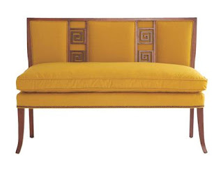
The Greek Key design/motif is one of those timeless almost iconic representations of a classic design which has become an integral part of architecture through to fashion. Originally used by the Greeks as a border on many architectural friezes, it has been used through the ages without overkill and still remains elegant.


The design itself is stark and intensely graphic. (Maybe that is why I like it so much).


Perhaps we can see the complete evolution of the design in the Givenchy logo, where the signature G, has been used 4 times in different rotations to form the logo.

Acrylic Savoir Faire

I must say that while doing research for blogging, that I continuously get sidetracked onto other topics, and the discovery of new things for savoir faire.

One I came across was an English artist called Michael Haynes who was an integral part of the London youth quake in the 60’s, and who must have inspired Phillipe Starck to a certain extent. Basically working in acrylic Haynes designed all manner of installations, furniture and artworks, whose buyers included major museums and the likes of Givenchy.

He was the major display designer in London in the 1960s and 70s, window displays and museum installations. Fame came with his store windows winning awards year after year and with Lady Churchill noticing in particular a window he did commemorating her husband.


Cecil Beaton enlisted his help to design the displays for his 1971 exhibition at the V & A “Fashion: An Anthology”. The results were settings that reflected the spirit and time the individual garments were designed in.
The Schiaparelli display.

The Balenciaga display


Another commission was the Swinging London display at Madame Tussaud’s in London in 1967.

It was a natural progression to move onto interior design and furniture. His designs continually reflect and evoke the era. They are a definitive representation of his work at its peak.


A fabulous piece of interior design work was the transformation of the interior of Elsfield Manor in England. It is a credit that his designs and final execution do not detract from the grand scale of the house. The only thing I am cringing over is the given loss of so many original fittings.


I love the theatrical qualities of the room below and the juxtaposition of the incredibly modern and bright coloured furniture with the statue of a soldier from a completely different era. The colours of the uniform provide a totally unexpected pop of colour in the bright yellows and greens of the overall scheme.

*All images from Michael Haynes

Monday, June 7, 2010

Zandra Faire!

I must admit that in the late 1970’s when I first became aware of Zandra Rhodes, I was not that captivated with her or her fashions. Instead I was following the classic chic of Givenchy and Yves Saint Laurent down the catwalk. I remember one particular season where Givenchy was showing wonderful polka dotted crepe de chine dresses in red and white or blue and white with the most wonderfully high two tone spectator pumps. Ms. Rhodes was a bit too arty and bohemian for the polished elegance I was interested in; however she was always present, not letting me forget that she was there, with her glam macquillage and shocing pink hair.


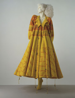
Given time over the years my opinion has changed and I look at Zandra Rhodes’ clothes in a new light, fully appreciative of the gorgeous fabrics, colours and designs. Ms Rhodes herself has kept her signature shocking pink hair and her sense of hard style over the years to put an undeniable stamp on the fashion world. The unique use of bold prints, fiercely feminine patterns and theatrical use of colour gives her garments a timeless quality that makes them unmistakably a Rhodes creation.

Fashion ran in Ms. Rhodes’ blood with her mother being a fitter for Worth, when they were still in business. Early designs were considered to outrageous for the somewhat conservative English public and even at odds with the space age designs being advocated by the Parisians across the channel.
Her fabrics are beautiful with many being hand painted or screen printed which translate perfectly into her design aesthetic. Her main inspiration comes from the organic forms of nature, to create clear, creative statements, dramatic but graceful, bold but feminine. Always the innovator, she has reversed seams and exposed them, and was one of the first to use safety pins to hold clothing together during the punk era. The 1977 pink and black jersey collection with holes and beaded safety pins earned her the name of "princess of punk".


Her clients have been as diverse as Royalty (Diana, Princess of Wales and HRH Princess Michael of Kent), Elizabeth Taylor, Jackie Onassis, Debbie Harry, Kylie Minogue and the late Isabella Blow.

Of course there have been the collaborations that have extended from cosmetics, shoes and china; however none of her designs are commercial parodies which have been overdone. They are a true representation of her and her work. Now she designs for the theatre and opera and numerous other projects.


This is one woman, whose savoir faire just keeps evolving, and I am glad that I now appreciate her work for what it is; beautiful artistic clothes and designs that stand the test of time!

Friday, June 4, 2010

Gem Stone Savoir Faire

Inspired by Jill over at Stella’s Roar and her latest post of the fabulous jewellery by Lanvin, I immediately thought of Helena Rubinstein and her passion for jewellery.

The below photographs say it all for Helena Rubinstein’s obsession for jewellery! She liked it big and a lot of it! Rumoured to have one of the most fabulous collections in the world, hers was not the stock standard diamonds one would find within other collections. Such was the fame of the collection that at one stage there was an attempted heist, with the thieves getting nothing but $200. (see previous post "Savoir faire with Pluck". She always wore masses of jewelry in public—especially rubies with ruby red lipstick and nail polish to match them.

Her collection was an Aladdin’s cave of the unusual, the oversized and valuable. Rubies the size of pigeon eggs vied for attention with cabochon stones of all shapes and sizes. Being so small in statue Madame relied on her jewellery to create an impact. Oversize pieces were the norm with her, which emphasised her presence, and eclipsed all other jewellery present. Combined with the simple suits she wore later in life one could not help but notice the jewellery. Necklace upon necklace was worn around her neck, while her wrists were weighed down with all manner of bracelets.

One can accuse Madame of only collecting for quantity over quality, and this to a certain extent is true. However, she had some important valuable pieces in her collection, such as a set of rubies that were rumoured to have belonged to Catherine the Great of Russia.

A great public relations trick Madame would play when entertaining the press or anybody for that matter would be to wear lots of cheaper items of jewellery. This would create an impact, that when admired by an admirer Madame would whip it off and give to the person in question saying that they must have it and that it was nothing!

At one stage she complained that the storage of the collection was giving her grief, so the story goes that her assistant bought her a filing cabinet (in the photo’s ?) and that diamonds etc were filed under the appropriate letter of the alphabet. She looks like a child sitting on the floor with her favourite toys spread all around her.


Madame definitely knew her style and what suited her. For what she lacked in beauty and stature she adorned herself in such a way that people could not help by notice her.

Thursday, June 3, 2010

Sterling Savoir Faire

Nothing beats great sterling silver and some of the best comes from Mappin & Webb in London. Silversmiths to the Queen, Mappin and Webb have been producing quality silver since 1810.

Here is some silver from Mappin and Webb which savoir faire is seriously coveting, to make my life even more complete with savoir faire!

In my formative years I could have been educated, entertained and nourished with this porringer from 1938.

If I coddled eggs for breakfast I would definitely be using this fabulous sterling egg coddler.

Then during the day I would be storing my biscuits in this fabulous biscuit barrel from 1890.

I could also pass the time of day just looking at the below enamel box from the 1930's

Come time for champagne before dinner, nothing else would do other than this silver wine cooler.

Menus for dinner held within these fabulous little menu holders.

And to finish all off if I was to be drinking brandy and smoking a cigar after dinner, the fabulous cigar lighter shaped like a hand grenade from 1918 would be it!

Blog Widget by LinkWithin