Monday, September 13, 2010

Mainstream Savoir Faire


I am not usually a fan of the H&M designer collaborations, however last year did see me line up for the Jimmy Choo diversion collection at H&M. While I was not overly impressed with the women’s wear and shoes, I did snap up for myself the men’s jeans and a pair of brown suede Chelsea Boots. I have to say that jeans have served me well and are one of my favourite pairs and the boots, I just adore.


It is with anticipation now that I wait for the next collaboration which is with Lanvin! Both women’s wear and menswear will be available, and I would be telling a lie to say I cannot wait! I used to think of myself as too old to line up, however am definitely considering doing this on November 20th when the collection is released. A preview will be released on November 2nd, so this might be the deciding factor!

"It wasn't a project about a dress for less," Elbaz (artistic director for Lanvin says. "I think I loved the idea that H&M is going luxury, rather than Lanvin is going public. I thought it was a smart project so I say, 'I do.'" And so do I.


An American in Paris

It is not often that an American becomes the toast of Paris and even admired and revered. It is even rarer in the world of Haute Couture. To date there has only been one American accepted into the holy inner circle of this veritable French institution.

Originally a native of Chicago Main Rousseau Bocher also known as Mainbocher was a graduate of the Chicago Academy of Fine Arts and served in France during World War I where he stayed on after the war had finished. Eventually becoming the editor-in-chief of Vogue, Mainbocher decided to open as couturier, due his critical eye and feeling for design. Fusing his first and last names together he opened in 1929.

Right from the beginning Mainbocher designed for an exclusive and wealthy clientele. Having none of the shock tactics as some of his fellow couturiers such as Schiaparelli, Mainbocher’s creations displayed a purity of line and proportion and simplicity that set them apart from the other creations of the other couturiers, except maybe Molyneux. This was savoir faire with discretion.


Clients read like a list of who’s who, cumulating in designing the wedding trousseau for Wallis Simpson and naming the colour ‘Wallis Blue” for her.

Maybe sensing that war was coming, his last collection in Paris created a furore. The “Mainbocher” corset radically confronted the sinuous fluidity of the designs of the thirties with a more constructed tailored silhouette. The corset that was the basis of this collection was immortalized by Horst in one of his most famous photographs.

With the advent of war Mainbocher relocated to New York setting up next door to Tiffany’s on 5th Avenue. In New York he established a clientele that was known for the supreme elegance of café society. In 1947 eight of the New York Dress Institute's Ten Best-Dressed Women in the World were Mainbocher clients.


Through the 50s and into the 60s, Mainbocher design was at its highest pitch of purity. A Mainbocher label meant invisible extravagance and deep discretion. In the two photographs of Gloria Vanderbilt below this is highly evident.


Retiring in 1971 Mainbocher closed his doors at the age of 81, leaving a lasting legacy of innovations in women’s fashion.

In an interview published in March 2009 in Interview Magazine, Hamish Bowles, the European Editor at Large for Vogue stated:

"I am absolutely crazy about Mainbocher’s clothes. I think they are so subtle, the detailing is so extraordinary, and they are so unbelievably evocative of such a particular time and place and milieu and lifestyle, of absolute subtle luxury. Even his work from when he had his couture salon in Paris through the ’30s—it has a kind of brisk edge to it and a crispness and a precision that is completely American. You can really see why a client like Wallis Windsor would have been drawn to his clothes, and why she became so emblematic of his work. It needs a café-society client who really understands Europe but has a kind of brisk, no-nonsense American edge”


Friday, September 10, 2010

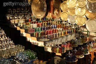
Moroccan Faire

I always like things that have a double purpose, i.e. I like using things for everyday use that I decorate with and vice versa. Objects that are not only decorative but functional rate high in the savoir faire world. One such item is the Moroccan tea Glass. Here is something that is not only decorative but has a myriad of uses that is not just limited to drinking tea.

Tea plays a large part in Moroccan culture and traditionally the tea is served three times, and the amount of time the tea has been steeping gives each of the three glasses of tea a unique flavor, described in this famous proverb:

Le premier verre est aussi amer que la vie, The first glass is as bitter as life

le deuxième est aussi fort que l'amour, The second glass is as strong as love

le troisième est aussi doux que la mort. The third glass is as gentle as death.

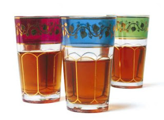
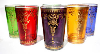
Of course we would all like to spend time in a Moroccan Market buying our own, however they can be acquired very cheaply from a large variety of stores and suppliers. Usually known for their intricate designs and bright colours they are just perfect for decorating and other uses.

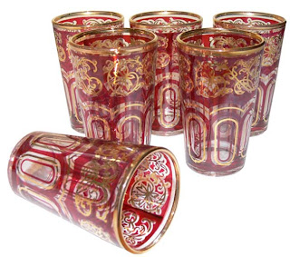
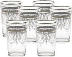
Build up sets of different colours for a truly vibrant and explosive look for display on shelves or table tops, or if the bright colours are not your thing , stick to a single colour. There are also truly elegant designs of clear glass with the most subtle of decorations in gold and other muted colours.


As mentioned before don’t just limited them to drinking tea out of. They are perfect for summer drinks or an aperitif before dinner.


They look fabulous with tea lights to create a truly intimate effect whether on the dinner table or around the home.


Deserts take on a whole new persona when served out of a tea glass.


Use them as vases for single flowers or planters to grow bulbs in such as the grape hyacinths below.


If the more traditional style is not your thing, there have been some modern adaptations as the ones below, which even though more modern in their approach, have not lost their charm.

Thursday, September 9, 2010

Dali Faire!

When one thinks of savoir faire in the art world, you cannot go past Salvador Dali. In everything he did he had immense personal style and savoir faire, which even extended down to his choice of pets. One of his favourites was an ocelot named Babou which travelled everywhere with him, whether across the Atlantic or out to dinner.

The below photo shows Dali and his private secretary Captain Moore in his cabin aboard the SS France prior to arrival in New York with Babou. This is full of surrealism and savoir faire, and would have appealed to Dali immensely.

An amusing story is how Dali with ocelot in tow were dining in a fashionable New York restaurant where Dali had tethered the animal to a leg of the table he was seated at while having dinner. A woman passed Dali and said ocelot and was horror stricken at the fact that a ‘wild animal’ was allowed in the restaurant.

"What is that?" she cried. "It's only a cat," Dali explained disdainfully. "I've painted it over with an op-art design." Looking again, (and recognising Dali) the woman sighed with relief. "I can see now that's what it is," she said. "At first I thought it was a real ocelot."

Wednesday, September 8, 2010

More Illustrated Savoir Faire

We are all familiar with the work of one of the most prolific graphic illustrators of the late twentieth century; however how many of us actually know the name behind some of the most iconic movie posters ever created?

The same artist was also responsible for a mountainous volume of advertising copy for various companies which embodied all the savoir faire of the 50’s, 60’s, 70’s and 80’s. In my humble opinion he could almost be the American equivalent of Rene Gruau.

The artist in question is Bob Peak, who has often been called the ‘father of the modern movie poster’. Singlehandedly he transformed the then traditional approach of movie advertising from basic collages of film stills or head shots to flamboyant artistic illustrations. His work included also included over 45 covers of Time with the most famous being his portrayal of Mother Teresa.


From advertising copy for companies such as Pepsi and Winston cigarettes to fashion illustration the Peak style is instantly recognizable. The subjects possessing all the savoir faire in the world as they use the featured product or wearing the featured clothes. Editorial illustrations were done for such magazines as Cosmopolitan and McCall’s.


TWA airlines commissioned posters, menus and magazine covers such as the ones below.


His movie poster career virtually took off when United Artists hired him to help promote west Side Story and the rest is history. The poster is a classic and recognized all over the world. Peak went on to create some of the most famous posters of the era including My Fair Lady, Funny Girl, Hair, Something Wicked This Way Comes, Apocalypse Now and countless others, with his final movie poster being for James Bond’s The Spy who Loved Me, which I copied in High School.


The illustrations themselves are glamorous; they also convey an idealized world which the rest of us aspired to. Some of the most famous names whether they are movie stars, politicians or just the man in the street have had the Peak treatment.

One of his greatest commissions was from US Post for 30 stamps commemorating the 1984 Olympics in Los Angeles


They don’t draw them like this any more!

Tuesday, September 7, 2010

Savoir Faire and the Art of Tea


As I mentioned in my last post before heading off to Montreal for the weekend, Montreal is a city of enormous savoir faire and always surprises me. A lot of French companies set up business there as their entrance into the North American market or just to serve the French speaking population.

One such company is Kusmi Tea. Walking along the Rue Saint Denis one afternoon I was drawn to a window display of fabulous coloured containers and upon closer inspection found that this was the Montreal headquarters of Kusmi Teas.

Founded in 1867 in St. Petersburg by Pavel Michailovitch Kousmichoff as a series of teahouses all over Russia. Kusmi then was then to become most famous for providing tea to the Russian royal court. Opening branches in London and Paris after the revolution and then between the wars opening offices in New York, Hamburg and Constantinople the business expanded.

The boutique is incredibly modern and decorated purely in white with splashes of red, which sets off the coloured labels of the Tea Tins and packaging perfectly.


The packaging itself is wonderful with the distinctive label in a variety of different colours shapes and sizes. We all know how much I adore packaging of anything and this does not disappoint. The label is distinctive blending traditional Russian backgrounds with up to date modern colours. One cannot help but notice it.


Over the years, fabrication of the exclusive blends has not changed: the meticulous selection of teas (from India, China and Ceylon), the confection of balanced and aromatic blends with the best natural essences from Grasse, Calabria and Madagascar. The Russian blends – made from a base of bergamot and citrus – created by the founder continue to be available and their recipes kept secret.


Needless to say I came away with the Russian sampler, a selection of 6 the Russian blends in the cutest little tins.

Blog Widget by LinkWithin